[TOC]
0x00 前言简介 什么是BootStrap? Mark Otto 和 Jacob Thornton 开发的推出的一个用于前端开发的开源工具包产品。
Bootstrap 是基于 HTML、CSS、JAVASCRIPT 的,它是一个简洁、直观、强悍的前端开发框架,可以让web开发更迅速、简单。
BootStrap有什么作用和特点?
特点:
简单容易上手,开源产品,提高开发人员的工作效率
移动设备优先:自 Bootstrap 3 起,框架包含了贯穿于整个库的移动设备优先的样式。
浏览器支持:所有的主流浏览器都支持 Bootstrap。
响应式设计(重点): Bootstrap 的响应式 CSS 能够自适应于台式机、平板电脑和手机;
BootStrap包含内容(主要包含):
基本结构:Bootstrap 提供了一个带有网格系统、链接样式、背景的基本结构CSS样式: BS中已经定义好了一套CSS的样式表布局组件: 用于创建图像、下拉菜单、导航、警告框、弹出框等等 JS插件: BootStrap定义了一套JS的插件,这些插件已经默认实现了很多种效果定制:您可以定制 Bootstrap 的组件、LESS 变量和 jQuery 插件来得到您自己的版本。
BS 环境版本分类:
可视化Boostrap开发:https://www.runoob.com/try/bootstrap/layoutit/
Bootstrap 环境安装:
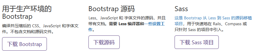
Bootstrap: Bootstrap CSS、JavaScript 和字体的预编译的压缩版本.
Source: 最新的 Bootstrap LESS 和 JavaScript 源代码.
CDN外联Link
[TOC]
0x00 前言简介 什么是BootStrap? Mark Otto 和 Jacob Thornton 开发的推出的一个用于前端开发的开源工具包产品。
Bootstrap 是基于 HTML、CSS、JAVASCRIPT 的,它是一个简洁、直观、强悍的前端开发框架,可以让web开发更迅速、简单。
BootStrap有什么作用和特点?
特点:
简单容易上手,开源产品,提高开发人员的工作效率
移动设备优先:自 Bootstrap 3 起,框架包含了贯穿于整个库的移动设备优先的样式。
浏览器支持:所有的主流浏览器都支持 Bootstrap。
响应式设计(重点): Bootstrap 的响应式 CSS 能够自适应于台式机、平板电脑和手机;
BootStrap包含内容(主要包含):
基本结构:Bootstrap 提供了一个带有网格系统、链接样式、背景的基本结构CSS样式: BS中已经定义好了一套CSS的样式表布局组件: 用于创建图像、下拉菜单、导航、警告框、弹出框等等 JS插件: BootStrap定义了一套JS的插件,这些插件已经默认实现了很多种效果定制:您可以定制 Bootstrap 的组件、LESS 变量和 jQuery 插件来得到您自己的版本。
BS 环境版本分类:
可视化Boostrap开发:https://www.runoob.com/try/bootstrap/layoutit/
Bootstrap 环境安装:
Bootstrap: Bootstrap CSS、JavaScript 和字体的预编译的压缩版本.
Source: 最新的 Bootstrap LESS 和 JavaScript 源代码.
CDN外联Link1 2 3 4 5 6 7 8 <link rel ="stylesheet" href ="https://cdn.jsdelivr.net/npm/bootstrap@3.3.7/dist/css/bootstrap.min.css" integrity ="sha384-BVYiiSIFeK1dGmJRAkycuHAHRg32OmUcww7on3RYdg4Va+PmSTsz/K68vbdEjh4u" crossorigin ="anonymous" > <link rel ="stylesheet" href ="https://cdn.jsdelivr.net/npm/bootstrap@3.3.7/dist/css/bootstrap-theme.min.css" integrity ="sha384-rHyoN1iRsVXV4nD0JutlnGaslCJuC7uwjduW9SVrLvRYooPp2bWYgmgJQIXwl/Sp" crossorigin ="anonymous" > <script src ="https://cdn.jsdelivr.net/npm/bootstrap@3.3.7/dist/js/bootstrap.min.js" integrity ="sha384-Tc5IQib027qvyjSMfHjOMaLkfuWVxZxUPnCJA7l2mCWNIpG9mGCD8wGNIcPD7Txa" crossorigin ="anonymous" > </script >
weiyigeek.top-
BS 文件结构
预编译的BootStrap1 2 3 4 5 6 7 8 9 10 11 12 13 14 15 16 17 18 19 20 21 22 C:\USERS\WEIYIGEEK\DOWNLOADS\BOOTSTRAP-3.3.7-DIST\BOOTSTRAP-3.3.7-DIST ├─css │ bootstrap-theme.css │ bootstrap-theme.css.map │ bootstrap-theme.min.css │ bootstrap-theme.min.css.map │ bootstrap.css │ bootstrap.css.map │ bootstrap.min.css │ bootstrap.min.css.map ├─fonts │ glyphicons-halflings-regular.eot │ glyphicons-halflings-regular.svg │ glyphicons-halflings-regular.ttf │ glyphicons-halflings-regular.woff │ glyphicons-halflings-regular.woff2 └─js bootstrap.js bootstrap.min.js npm.js
Bootstrap 源代码1 2 3 4 5 6 7 8 9 10 - less/ - js/ - fonts/ - dist/ - css/ - js/ - fonts/ - docs-assets/ - examples/ - *.html
BootStrap需求样例 1 2 3 4 5 6 7 8 9 10 11 12 13 14 15 16 17 18 19 20 21 22 23 24 25 26 27 28 <!DOCTYPE html> <html lang ="en" > <head > <meta charset ="UTF-8" > <meta name ="viewport" content ="width=device-width, initial-scale=1.0" > <title > BootStrap Rquirement Demo</title > <link rel ="stylesheet" href ="https://cdn.staticfile.org/twitter-bootstrap/3.3.7/css/bootstrap.min.css" > </head > <body > <div class ="container" > <div class ="jumbotron" > <h1 > BootStrap 使用案例</h1 > <p > 我的第一个BootStrap页面: Hello World!</p > <p > <a class ="btn btn-primary btn-lg" href ="https://weiyigeek.club" > My Blog </a > </p > </div > </div > <script src ="https://cdn.staticfile.org/jquery/2.1.1/jquery.min.js" > </script > <script src ="https://cdn.staticfile.org/twitter-bootstrap/3.3.7/js/bootstrap.min.js" > </script > </body >
0x01 BS CSS样式分类 描述:BS使用了一些 HTML5 元素和 CSS 属性满足一些新特性:
BS设计目标是移动设备优先然后才是桌面设备;
BS全局显示、排版和链接
响应式布局以及图像响应式
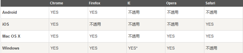
BS支持跨浏览器一致性:使用了 Normalize.css 是一个很小的 CSS 文件,在 HTML 元素的默认样式中提供了更好的跨浏览器一致性
BS支持 Internet Explorer 8 及更高版本的 IE 浏览器
weiyigeek.top-浏览器支持情况
(1) 移动设备优先策略
内容:决定什么内容是最重要的
布局:优先设计更小的宽度,基础的 CSS 是移动设备优先,媒体查询是针对于平板电脑、台式电脑。
渐进增强:随着屏幕大小的增加而添加元素
(2) meta 源标签 viewport meta 标签 为了让 Bootstrap 开发的网站对移动设备友好,确保适当的绘制和触屏缩放:1 2 3 4 5 6 7 8 9 10 11 <meta name ="viewport" content ="width=device-width, initial-scale=1.0" > <meta name ="viewport" content ="width=device-width, initial-scale=1.0, maximum-scale=1.0, user-scalable=no" >
补充说明:1 2 3 4 5 6 7 8 9 10 11 12 13 14 15 16 17 18 19 20 21 22 23 24 25 26 27 28 29 30 31 32 33 34 35 36 37 38 39 40 41 42 43 44 45 46 47 48 49 50 51 <meta charset ="UTF-8" > <meta http-equiv ="refresh" content ="5;url=" /> <link rel ="copyright" href ="copyright.html" /> <meta http-equiv ="X-UA-Compatible" content ="IE=edge" /> <meta name ="viewport" content ="width=device-width, initial-scale=1" /> <meta name ="description" content ="150 words" /> <meta name ="keywords" content ="your tags" /> <meta name ="robots" content ="index,follow" /> <meta name ="author" content ="author name" /> <meta name ="google" content ="index,follow" /> <meta name ="googlebot" content ="index,follow" /> <meta name ="verify" content ="index,follow" /> <meta name ="apple-mobile-web-app-capable" content ="yes" /> <meta name ="apple-mobile-web-app-status-bar-style" content ="black-translucent" /> <meta name ="apple-mobile-web-app-title" content ="标题" > <meta content ="telephone=no" name ="format-detection" /> <meta content ="email=no" name ="format-detection" /> <meta name ="apple-itunes-app" content ="app-id=myAppStoreID, <br>affiliate-data=myAffiliateData, app-argument=myURL" /> <meta name ="HandheldFriendly" content ="true" > <meta name ="MobileOptimized" content ="320" > <meta name ="screen-orientation" content ="portrait" > <meta name ="x5-orientation" content ="portrait" > <meta name ="full-screen" content ="yes" > <meta name ="x5-fullscreen" content ="true" > <meta name ="browsermode" content ="application" > <meta name ="x5-page-mode" content ="app" > <meta name ="msapplication-tap-highlight" content ="no" >
排版 (1) 全局显示、排版和链接 1 2 3 4 5 6 7 8 body { margin : 0 ; font-family : "Helvetica Neue" , Helvetica, Arial, sans-serif; font-size : 14px ; line-height : 1.428571429 ; color : #333333 ; background-color : #ffffff ; }
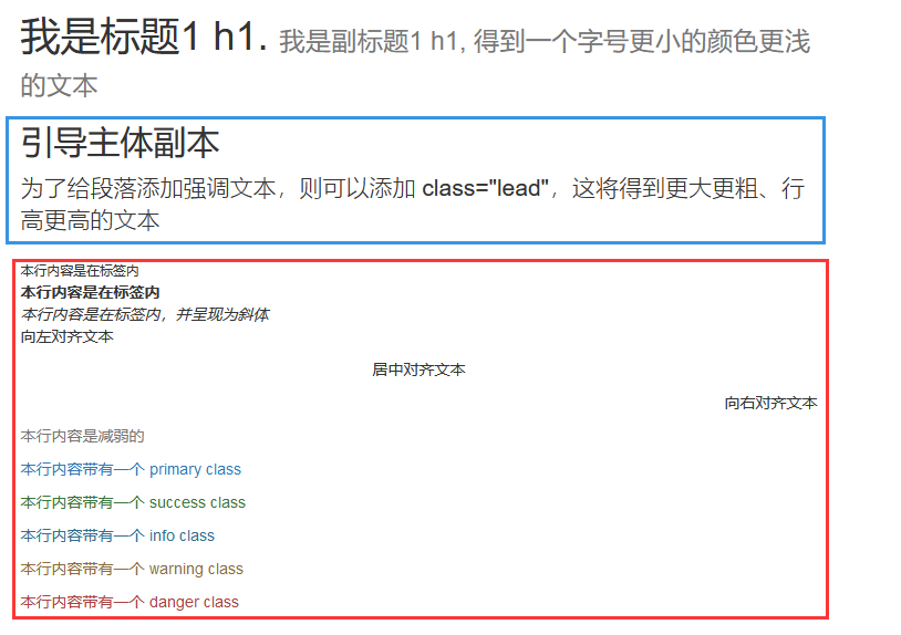
BS排版您可以创建标题、段落、列表及其他内联元素。
使用 @font-family-base、 @font-size-base 和 @line-height-base 属性作为排版样式。
使用 Helvetica Neue、 Helvetica、 Arial 和 sans-serif 作为其默认的字体栈。
强调使用的class类名
1 2 3 4 5 6 7 8 9 10 11 12 13 14 15 16 17 18 19 20 21 22 23 24 25 26 27 28 29 30 31 32 33 34 .lead : 使段落突出显示.small : 设定小文本 (设置为父文本的 85% 大小).text-muted :提示,使用浅灰色(#999 ).text-primary :主要,使用蓝色(#428bca ).text-success :成功,使用浅绿色(#3c763d ).text-info :通知信息,使用浅蓝色(#31708f ).text-warning :警告,使用黄色(#8a6d3b ).text-danger :危险,使用褐色(#a94442 ).text-left : 文本向左.text-center : 文本居中.text-right : 文本向右.text-justify : 设定文本对齐,段落中超出屏幕部分文字自动换行.text-nowrap : 段落中超出屏幕部分不换行.pull-left : 元素向左.pull-center : 元素居中.pull-right : 元素向右.blockquote-reverse : 设定引用右对齐.text-lowercase : Lowercased text (小写文本).text-uppercase : Uppercased text (大写文本) .text-capitalize : Capitalized text (首字母大写文本).initialism : 显示在 <abbr > 元素中的文本以小号字体展示,且可以将小写字母转换为大写字母.pre-scrollable : 使 <pre > 元素可滚动,代码块区域最大高度为340px 一旦超出这个高度,就会在Y 轴出现滚动条.list-unstyled : 移除默认的列表样式,列表项中左对齐 ( <ul > 和 <ol > 中).list-inline : 将所有列表项放置同一行.dl-horizontal : 该类设置了浮动和偏移,应用于 <dl > 元素和 <dt > 元素中,具体实现可以查看实例
基础示例:1 2 3 4 5 6 7 8 9 10 11 12 13 14 15 16 17 18 19 20 21 22 23 24 25 26 27 28 29 30 31 32 33 34 35 36 37 38 39 40 41 42 43 44 45 46 47 48 49 50 51 52 53 54 55 56 <h1 > 我是标题1 h1. <small > 我是副标题1 h1, 得到一个字号更小的颜色更浅的文本</small > <p > 这是一个普通的段落。</p > <p class ="small" > 这是个文字更小。</p > </h1 > <h2 > 引导主体副本</h2 > <p class ="lead" > 为了给段落添加强调文本,则可以添加 class="lead",这将得到更大更粗、行高更高的文本</p > <small > 本行内容是在标签内</small > <br > <strong > 本行内容是在标签内</strong > <br > <em > 本行内容是在标签内,并呈现为斜体</em > <br > <p class ="text-left" > 向左对齐文本</p > <p class ="text-center" > 居中对齐文本</p > <p class ="text-right" > 向右对齐文本</p > <p class ="text-muted" > 本行内容是减弱的</p > <p class ="text-primary" > 本行内容带有一个 primary class</p > <p class ="text-success" > 本行内容带有一个 success class</p > <p class ="text-info" > 本行内容带有一个 info class</p > <p class ="text-warning" > 本行内容带有一个 warning class</p > <p class ="text-danger" > 本行内容带有一个 danger class</p > <abbr title ="World Wide Web" > WWW</abbr > <br > <abbr title ="Real Simple Syndication" class ="initialism" > RSS</abbr > <address > <strong > Some Company, Inc.</strong > <br > 007 street<br > Some City, State XXXXX<br > <abbr title ="Phone" > P:</abbr > (123) 456-7890 </address > <address > <strong > Full Name</strong > <br > <a href ="mailto:#" > mailto@somedomain.com</a > </address > <blockquote > <p > 这是一个带有源标题的引用。</p > <small > Someone famous in <cite title ="Source Title" > Source Title(引用)</cite > </small > </blockquote > <blockquote class ="pull-right" > 这是一个向右对齐的引用。 <small > Someone famous in <cite title ="Source Title" > Source Title(引用)</cite > </small > </blockquote >
weiyigeek.top-
基础示例:1 2 3 4 5 6 7 8 9 10 11 12 13 14 15 <div class ="page-header" > <h1 > 标题 <small > 子标题</small > </h1 > </div > <p > 我是一段内容</p > <div class ="page-header" > <h1 > 页面标题实例 <small > 子标题</small > </h1 > </div > <p > 这是一个示例文本。这是一个示例文本。这是一个示例文本。这是一个示例文本。这是一个示例文本。</p >
weiyigeek.top-
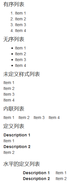
列表在BS中支持有序列表、无序列表和定义列表。
有序列表:有序列表是指以数字或其他有序字符开头的列表。无序列表:无序列表是指没有特定顺序的列表,是以传统风格的着重号开头的列表。
如果您不想显示这些着重号,您可以使用 class .list-unstyled 来移除样式。
您也可以通过使用 class .list-inline 把所有的列表项放在同一行中。
定义列表:在这种类型的列表中,每个列表项可以包含 dt 和 dd 元素。
dt 代表 定义术语,就像字典。接着dd 是dt 的描述。
.dl-horizontal 可以让 dl 内的短语及其描述排在一行。开始是像 dl 的默认样式堆叠在一起,随着导航条逐渐展开而排列在一行。
1 2 3 4 5 6 7 8 9 10 11 12 13 14 15 16 17 18 19 20 21 22 23 24 25 26 27 28 29 30 31 32 33 34 35 36 37 38 39 40 41 42 43 44 45 46 47 <h4 > 有序列表</h4 > <ol > <li > Item 1</li > <li > Item 2</li > <li > Item 3</li > <li > Item 4</li > </ol > <h4 > 无序列表</h4 > <ul > <li > Item 1</li > <li > Item 2</li > <li > Item 3</li > <li > Item 4</li > </ul > <h4 > 未定义样式列表</h4 > <ul class ="list-unstyled" > <li > Item 1</li > <li > Item 2</li > <li > Item 3</li > <li > Item 4</li > </ul > <h4 > 内联列表</h4 > <ul class ="list-inline" > <li > Item 1</li > <li > Item 2</li > <li > Item 3</li > <li > Item 4</li > </ul > <h4 > 定义列表</h4 > <dl > <dt > Description 1</dt > <dd > Item 1</dd > <dt > Description 2</dt > <dd > Item 2</dd > </dl > <h4 > 水平的定义列表 dl 标签定义了定义列表(definition list) dt (定义列表中的项目) dd (描述列表中的项目) </h4 > <dl class ="dl-horizontal" > <dt > Description 1</dt > <dd > Item 1</dd > <dt > Description 2</dt > <dd > Item 2</dd > </dl >
weiyigeek.top-List列表
(4) 容器 <div class="container"></div>, 占据全部视口(viewport)采用container-fluid类;
1 2 3 4 5 6 7 8 9 10 11 12 13 14 15 16 17 18 19 20 21 22 23 24 25 .container { padding-right : 15px ; padding-left : 15px ; margin-right : auto; margin-left : auto; } .container :before ,.container :after { display : table; content : " " ; } .container :after { clear : both; }
container 与 container-fluid类区别说明:
(0).container 类用于固定宽度并支持响应式布局的容器。.container-fluid 类用于 100% 宽度,占据全部视口(viewport)的容器。
(1).container类出现内边距和外边距,.container-fluid类没有它是将宽度设定为auto,所以当缩放浏览器时,它会保持全屏大小,始终保持100%的宽度。。
(2).container类左右内边距一直是15px,屏幕小于等于767px的时候没有margin值,屏幕大于767px开始有左右margin值,屏幕宽度为768px和1000px的时候,margin值相对最小,分别是9px和15px,其他时候margin值随着屏幕的增大而增大。.container-fluid类宽度不管屏幕宽度大小,一直是100%。
(5) 超大屏幕 Jumbotron
超大屏幕(Jumbotron)。顾名思义该组件可以增加标题的大小,并为登陆页面内容添加更多的外边距(margin)
基础示例:1 2 3 4 5 6 7 8 9 10 11 12 13 14 15 16 17 18 19 20 21 22 23 24 25 <div class ="jumbotron text-center" style ="margin-bottom:0" > <h1 > 我的第一个 Bootstrap 页面</h1 > <p > 重置浏览器窗口大小查看效果!</p > </div > <div class ="container" > <div class ="jumbotron" > <h1 > 欢迎登陆页面!</h1 > <p > 这是一个超大屏幕(Jumbotron)的实例。</p > <p > <a class ="btn btn-primary btn-lg" role ="button" > 学习更多</a > </p > </div > </div > <div class ="jumbotron" > <div class ="container" > <h1 > 欢迎登陆页面!</h1 > <p > 这是一个超大屏幕(Jumbotron)的实例。</p > <p > <a class ="btn btn-primary btn-lg" role ="button" > 学习更多</a > </p > </div > </div >
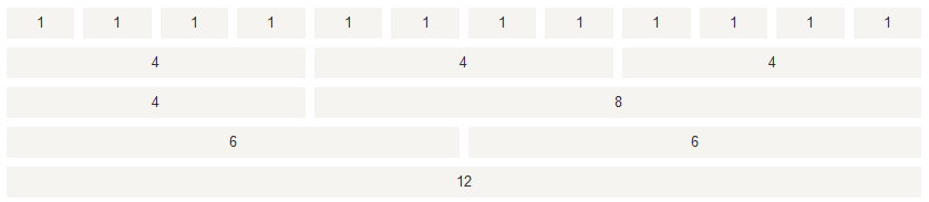
weiyigeek.top-一行最多12列
Grid 网格 描述:网格系统(Grid System)提供了一套响应式、移动设备优先的流式网格系统;随着设备或视口大小的增加而适当地扩展到 12 列。它包含了用于简单的布局选项的预定义类,也包含了用于生成更多语义布局的功能强大的混合类。
weiyigeek.top-一行最多12列
什么是网格(Grid)?
[Grid System]的工作原理:
行必须放置在 .container class 内,以便获得适当的对齐(alignment)和内边距(padding)。
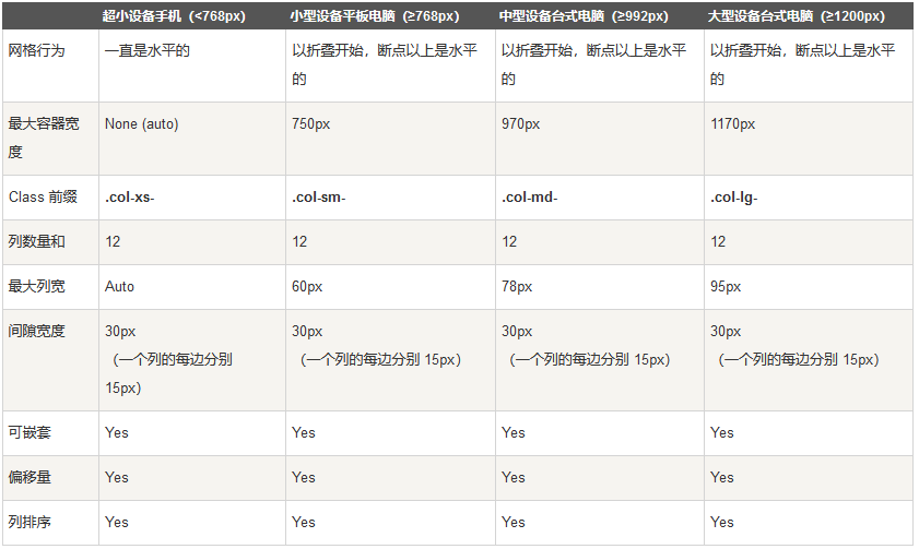
使用行 .row class 来创建列col-xs-n(手机) col-sm-n(平板) col-md-n(电脑) col-lg-n(大桌面显示器)的水平组。
.col-xs- 超小屏幕 手机 (<768px)
.col-sm- 小屏幕 平板 (≥768px)
.col-md- 中等屏幕 桌面显示器 (≥992px)
.col-lg- 大屏幕 大桌面显示器 (≥1200px)
内容应该放置在列内,且唯有列可以是行的直接子元素。
预定义的网格类比如 .row 和 .col-xs-4,可用于快速创建网格布局。LESS 混合类可用于更多语义布局。
列通过内边距 padding来创建列内容之间的间隙。该内边距是通过 .rows 上的外边距(margin)取负,表示第一列和最后一列的行偏移。
网格系统是通过指定您想要横跨的十二个可用的列来创建的。例如要创建三个相等的列,则使用三个 .col-xs-4 满足 1行十二列;
网页媒体查询是非常别致的”有条件的 CSS 规则”,常常用做于网页自适应;先是一个设备规范,然后是一个大小规则1 2 3 4 5 6 7 8 9 10 11 12 @media (max-width: @screen-xs-max) { ... } @media (min-width: @screen-sm-min) and (max-width: @screen-sm-max) { ... } @media (min-width: @screen-md-min) and (max-width: @screen-md-max) { ... } @media (min-width: @screen-lg-min) { ... }
Bootstrap 网格系统如何跨多个设备工作:
weiyigeek.top-
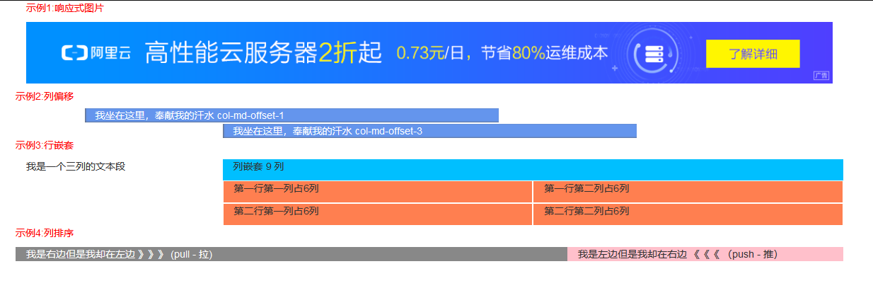
偏移列 .col-md-offset-*类,其中 * 范围是从 1 到 11。
嵌套列 列内添加一组 .col-md- 列;
列排序 .col-md-push-* (推)和 .col-md-pull-* (拉)类的内置网格列的顺序,其中 * 范围是从 1 到 11。
基础示例:1 2 3 4 5 6 7 8 9 10 11 12 13 14 15 16 17 18 19 20 21 22 23 24 25 26 27 28 29 30 31 32 33 34 35 36 37 38 39 40 41 42 43 44 45 46 47 48 49 50 51 52 53 54 55 56 57 58 59 60 61 62 63 64 65 66 67 68 69 70 71 72 73 74 75 76 <!DOCTYPE html> <html lang ="en" > <head > <meta charset ="UTF-8" > <meta name ="viewport" content ="width=device-width, initial-scale=1.0" > <meta http-equiv ="X-UA-Compatible" content ="ie=edge" > <title > Demo 3 HTML</title > <link rel ="stylesheet" href ="https://cdn.staticfile.org/twitter-bootstrap/3.3.7/css/bootstrap.min.css" > </head > <body > <div class ="container" > <div class ="row" > <div class ="col-xs-12 col-sm-12 col-md-12 col-lg-12" > <p style ="color: red;" > 示例1:响应式图片</p > <img src ="http://www.htmleaf.com/templets/default/images/alyun-1180-90.png" class ="img-responsive" alt ="阿里云" srcset ="" > </div > </div > <div class ="row" > <h5 style ="color: red;" > 示例2:列偏移</h5 > <div class ="col-md-6 col-md-offset-1" style ="color: white;background-color: cornflowerblue; box-shadow: inset 1px -1px 1px #666666;" > 我坐在这里,奉献我的汗水 col-md-offset-1 </div > <div class ="col-md-6 col-md-offset-3" style ="color: white;background-color: cornflowerblue; box-shadow: inset 1px -1px 1px #666666;margin-top: 2px;" > 我坐在这里,奉献我的汗水 col-md-offset-3 </div > </div > <div class ="row" > <p style ="color: red;" > 示例3:行嵌套</p > <div class ="col-md-3" > <p > 我是一个三列的文本段</p > </div > <div class ="col-md-9" style ="background-color: deepskyblue;" > <p > 列嵌套 9 列</p > <div class ="row" > <div class ="col-md-6" style ="background-color: coral;border: white solid 1px ;" > <p > 第一行第一列占6列</p > </div > <div class ="col-md-6" style ="background-color: coral;border: white solid 1px ;" > <p > 第一行第二列占6列</p > </div > </div > <div class ="row" > <div class ="col-md-6" style ="background-color: coral;border: white solid 1px ;" > <p > 第二行第一列占6列</p > </div > <div class ="col-md-6" style ="background-color: coral;border: white solid 1px ;" > <p > 第二行第二列占6列</p > </div > </div > </div > </div > <div class ="row" > <p style ="color: red;" > 示例4:列排序</p > <div class ="col-md-4 col-md-push-8" style ="background-color: pink" > 我是左边但是我却在右边 《《《 (push - 推) </div > <div class ="col-md-8 col-md-pull-4" style ="background-color: #888;color: white;" > 我是右边但是我却在左边 》》》 (pull - 拉) </div > </div > </div > <script src ="https://cdn.staticfile.org/jquery/2.1.1/jquery.min.js" > </script > <script src ="https://cdn.staticfile.org/twitter-bootstrap/3.3.7/js/bootstrap.min.js" > </script > </body > </html >
weiyigeek.top-
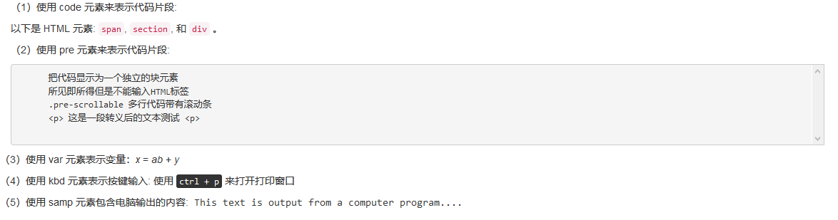
BS 代码展示 两种方式显示代码:
<code>:内联显示代码<pre>:显示为一个独立的块元素或者代码有多行<var>:显示变量赋值<kbd>:按键文本提示<samp>: 电脑程序输出格式显示
基础示例:1 2 3 4 5 6 7 8 9 10 11 12 13 14 15 16 17 18 <div class ="container" > <p > (1)使用 code 元素来表示代码片段:</p > <p > 以下是 HTML 元素: <code > span</code > , <code > section</code > , 和 <code > div</code > 。</p > <p > (2)使用 pre 元素来表示代码片段:</p > <pre class ="pre-scrollable" > 把代码显示为一个独立的块元素 所见即所得但是不能输入HTML标签 .pre-scrollable 多行代码带有滚动条 <p> 这是一段转义后的文本测试 <p> </pre > <div class ="row" > <p > (3)使用 var 元素表示变量:<var > x</var > = <var > a</var > <var > b</var > + <var > y</var > </p > <p > (4)使用 kbd 元素表示按键输入: 使用 <kbd > ctrl + p</kbd > 来打开打印窗口 </p > <p > (5)使用 samp 元素包含电脑输出的内容:<samp > This text is output from a computer program....</samp > </p > </div > </div >
weiyigeek.top-
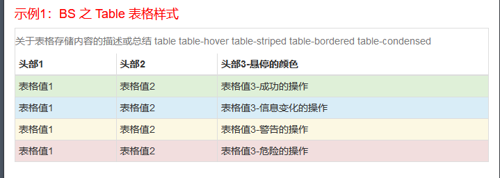
Table 表格 描述:提供了一个清晰的创建表格的布局;1 2 3 4 5 6 .table-responsive .table .table-striped .table-bordered .table-hover .table-condensed
下表的类可用于表格的行或者单元格:1 2 3 4 5 .active 将悬停的颜色应用在行或者单元格上 .success 表示成功的操作 .info 表示信息变化的操作 .warning 表示一个警告的操作 .danger 表示一个危险的操作
基础示例:1 2 3 4 5 6 7 8 9 10 11 12 13 14 15 16 17 18 19 20 21 22 23 24 25 26 27 28 29 30 31 32 33 34 35 36 37 38 39 40 41 42 43 44 45 46 47 48 49 50 51 52 53 54 55 56 57 58 59 60 61 62 63 64 65 66 67 68 69 <!DOCTYPE html> <html lang ="en" > <head > <meta charset ="UTF-8" > <meta name ="viewport" content ="width=device-width, initial-scale=1.0" > <meta http-equiv ="X-UA-Compatible" content ="ie=edge" > <title > BootStrap CSS学习示例 </title > <link rel ="stylesheet" href ="https://cdn.staticfile.org/twitter-bootstrap/3.3.7/css/bootstrap.min.css" > </head > <body > <div class ="container" > <h4 style ="color:red" > 示例1:BS 之 Table 表格样式 </h4 > <div class ="table-responsive" > <table class ="table table-hover table-striped table-bordered table-condensed" > <caption > 关于表格存储内容的描述或总结 table table-hover table-striped table-bordered table-condensed</caption > <thead > <tr class ="action" > <th > 头部1</th > <th > 头部2</th > <th > 头部3-悬停的颜色</th > </tr > </thead > <tbody > <tr class ="success" > <td > 表格值1</td > <td > 表格值2</td > <td > 表格值3-成功的操作</td > </tr > <tr class ="info" > <td > 表格值1</td > <td > 表格值2</td > <td > 表格值3-信息变化的操作</td > </tr > <tr class ="warning" > <td > 表格值1</td > <td > 表格值2</td > <td > 表格值3-警告的操作</td > </tr > <tr class ="danger" > <td > 表格值1</td > <td > 表格值2</td > <td > 表格值3-危险的操作</td > </tr > </tbody > </table > </div > </div > <script src ="https://cdn.staticfile.org/jquery/2.1.1/jquery.min.js" > </script > <script src ="https://cdn.staticfile.org/twitter-bootstrap/3.3.7/js/bootstrap.min.js" > </script > </body > </html >
weiyigeek.top-
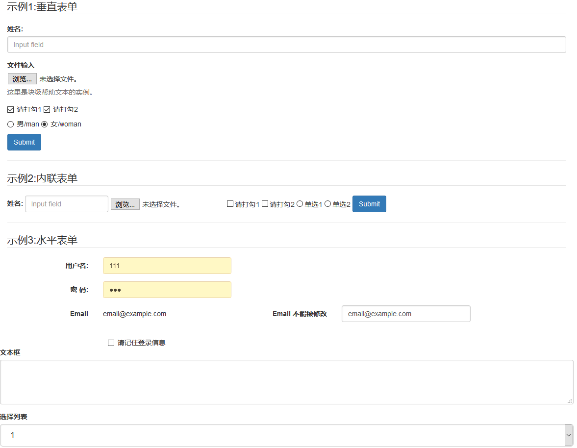
描述:Bootstrap 提供了下列类型的表单布局 垂直表单(默认) / 内联表单 / 水平表单input、textarea、checkbox、radio 和 select。
1 2 3 4 5 6 7 8 9 10 11 12 13 14 15 16 17 18 19 <form role="form" > .form-inline .form-horizontal .form-group .sr-only .control-label .form-control .checkbox .radio .checkbox-inline .radio-inline .form-control-static .help -block .has-warning、 .has-error 或 .has-success .input-* .col-lg-*
基础示例:1 2 3 4 5 6 7 8 9 10 11 12 13 14 15 16 17 18 19 20 21 22 23 24 25 26 27 28 29 30 31 32 33 34 35 36 37 38 39 40 41 42 43 44 45 46 47 48 49 50 51 52 53 54 55 56 57 58 59 60 61 62 63 64 65 66 67 68 69 70 71 72 73 74 75 76 77 78 79 80 81 82 83 84 85 86 87 88 89 90 91 92 93 94 95 96 97 98 99 100 101 102 103 104 105 106 107 108 109 110 111 112 113 114 115 116 117 118 119 120 121 122 123 124 125 126 127 128 129 130 131 132 133 134 135 136 137 138 139 140 141 142 143 144 145 146 147 148 149 150 151 152 153 154 155 156 157 158 159 160 161 162 163 164 165 166 167 168 169 170 171 172 173 174 175 176 177 178 179 180 181 182 183 184 185 186 187 188 189 190 191 192 193 194 195 196 197 198 199 200 201 202 203 204 <!DOCTYPE html> <html lang ="en" > <head > <meta charset ="UTF-8" > <meta name ="viewport" content ="width=device-width, initial-scale=1.0" > <meta http-equiv ="X-UA-Compatible" content ="ie=edge" > <title > BootStrap CSS学习示例 </title > <link rel ="stylesheet" href ="https://cdn.staticfile.org/twitter-bootstrap/3.3.7/css/bootstrap.min.css" > </head > <body > <div class ="container" > <form action ="#" method ="POST" role ="form" > <legend > 示例1:垂直表单</legend > <div class ="form-group" > <label for ="name" > 姓名:</label > <input type ="text" class ="form-control" id ="name" placeholder ="Input field" > </div > <div class ="form-group" > <label for ="inputfile" > 文件输入</label > <input type ="file" id ="inputfile" > <p class ="help-block" > 这里是块级帮助文本的实例。</p > </div > <div class ="checkbox" > <label > <input type ="checkbox" > 请打勾1 </label > <label > <input type ="checkbox" > 请打勾2 </label > </div > <div class ="radio" > <label for ="danxuan1" > <input type ="radio" name ="sex" id ="danxuan1" value ="1" checked ="true" > 男/man</label > <label for ="danxuan2" > <input type ="radio" name ="sex" id ="danxuan2" value ="2" > 女/woman </input > </label > </div > <button type ="submit" class ="btn btn-primary" > Submit</button > </form > <hr > <form action ="#" method ="POST" role ="form" class ="form-inline" > <legend > 示例2:内联表单</legend > <div class ="form-group" > <label for ="" > 姓名:</label > <input type ="text" class ="form-control" id ="name" placeholder ="Input field" > </div > <div class ="form-group" > <label class ="sr-only" for ="inputfile" > 文件输入</label > <input type ="file" id ="inputfile" > </div > <div class ="checkbox" > <label > <input type ="checkbox" > 请打勾1 </label > <label > <input type ="checkbox" > 请打勾2 </label > <label for ="danxuan1" > <input type ="radio" name ="danxuan1" id ="danxuan1" > 单选1 </input > </label > <label for ="danxuan2" > <input type ="radio" name ="danxuan1" id ="danxuan2" > 单选2 </input > </label > </div > <button type ="submit" class ="btn btn-primary" > Submit</button > </form > <hr > <form action ="#" method ="POST" role ="form" class ="form-horizontal" > <legend > 示例3:水平表单</legend > <div class ="form-group" > <label for ="username" class ="col-sm-2 control-label" > 用户名:</label > <div class ="col-sm-3" > <input type ="text" class ="form-control" id ="username" placeholder ="请输入用户名" > </div > </div > <div class ="form-group" > <label for ="password" class ="col-sm-2 control-label" > 密 码:</label > <div class ="col-sm-3" > <input type ="password" class ="form-control" id ="password" placeholder ="请输入密码" > </div > </div > <div class ="form-group" > <label class ="col-sm-2 control-label" > Email</label > <div class ="col-sm-3" > <p class ="form-control-static" > email@example.com</p > </div > <label class ="col-sm-2 control-label" > Email 不能被修改 </label > <div class ="col-sm-3" > <p class ="form-control" > email@example.com</p > </div > </div > <div class ="col-sm-offset-2 col-sm-10" > <div class ="checkbox" > <label for ="remember" > <input type ="checkbox" name ="remember" id ="remember" > 请记住登录信息 </label > </div > </div > <div class ="form-group" > <label for ="name" > 文本框</label > <textarea class ="form-control" rows ="3" > </textarea > </div > <div class ="form-group" > <label for ="name" > 选择列表</label > <select class ="form-control input-lg" > <option > 1</option > <option > 2</option > <option > 3</option > <option > 4</option > <option > 5</option > </select > <label for ="name" > 可多选的选择列表</label > <select multiple class ="form-control input-sm" > <option > 1</option > <option > 2</option > <option > 3</option > <option > 4</option > <option > 5</option > </select > <div class ="form-group" > <label class ="col-sm-2 control-label" > 聚焦</label > <div class ="col-sm-10" > <input class ="form-control" id ="focusedInput" type ="text" value ="该输入框获得焦点..." > </div > </div > <div class ="form-group" > <label for ="inputPassword" class ="col-sm-2 control-label" > 禁用 </label > <div class ="col-sm-10" > <input class ="form-control" id ="disabledInput" type ="text" placeholder ="该输入框禁止输入..." disabled > </div > </div > <fieldset disabled > <div class ="form-group" > <label for ="disabledTextInput" class ="col-sm-2 control-label" > 禁用输入(Fieldset disabled) </label > <div class ="col-sm-10" > <input type ="text" id ="disabledTextInput" class ="form-control" placeholder ="禁止输入" > </div > </div > <div class ="form-group" > <label for ="disabledSelect" class ="col-sm-2 control-label" > 禁用选择菜单(Fieldset disabled) </label > <div class ="col-sm-10" > <select id ="disabledSelect" class ="form-control" > <option > 禁止选择</option > </select > </div > </div > </fieldset > <div class ="form-group has-success" > <label class ="col-sm-2 control-label" for ="inputSuccess" > 输入成功 </label > <div class ="col-sm-10" > <input type ="text" class ="form-control" id ="inputSuccess" > </div > </div > <div class ="form-group has-warning" > <label class ="col-sm-2 control-label" for ="inputWarning" > 输入警告 </label > <div class ="col-sm-10" > <input type ="text" class ="form-control" id ="inputWarning" > </div > </div > <div class ="form-group has-error" > <label class ="col-sm-2 control-label" for ="inputError" > 输入错误 </label > <div class ="col-sm-10" > <input type ="text" class ="form-control" id ="inputError" > </div > </div > <div class ="form-group" > <div class ="col-sm-offset-2 col-sm-8" > <button type ="submit" class ="btn btn-primary" > 登录</button > <button type ="reset" class ="btn btn-info" > 清空</button > </div > </div > </form > </div > <script src ="https://cdn.staticfile.org/jquery/2.1.1/jquery.min.js" > </script > <script src ="https://cdn.staticfile.org/twitter-bootstrap/3.3.7/js/bootstrap.min.js" > </script > </body > </html >
weiyigeek.top-
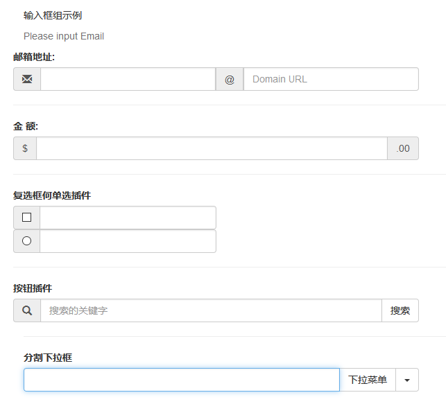
输入框组扩展自表单控件。使用输入框组,您可以很容易地向基于文本的输入框添加作为前缀和后缀的文本或按钮。
1 2 3 4 5 6 7 8 9 .bs-example .bs-example-form .input-group .input-group-addon .input-group-btn input-group-lg input-group-sm
基础案例1 2 3 4 5 6 7 8 9 10 11 12 13 14 15 16 17 18 19 20 21 22 23 24 25 26 27 28 29 30 31 32 33 34 35 36 37 38 39 40 41 42 43 44 45 46 47 48 49 50 51 52 53 54 55 56 57 58 59 60 61 62 63 64 65 66 67 68 69 70 71 <p > 输入框组示例</p > <div role ="inputgroup" > <span class ="help-block" > Please input Email</span > <form action ="#" class ="bs-example bs-example-form" role ="form" > <div class ="row" > <label for ="emailname" > 邮箱地址:</label > <div class ="input-group col-md-6" > <span class ="input-group-addon" > <span class ="glyphicon glyphicon-envelope" > </span > </span > <input type ="text" class ="form-control" name ="emailname" id ="emailname" > <span class ="input-group-addon" > @</span > <input type ="text" name ="domain" class ="form-control" placeholder ="Domain URL" > </div > <hr > <label for ="money" > 金 额:</label > <div class ="input-group col-md-6" > <span class ="input-group-addon" > $</span > <input type ="text" class ="form-control" name ="money" id ="money" > <span class ="input-group-addon" > .00</span > </div > <hr > <label for ="" > 复选框何单选插件</label > <div class ="input-group col-md-3" > <span class ="input-group-addon" > <input type ="checkbox" name ="checkout" > </span > <input type ="text" class ="form-control" > </div > <div class ="input-group col-md-3" > <span class ="input-group-addon" > <input type ="radio" name ="radio" > </span > <input type ="text" class ="form-control" > </div > <hr > <label for ="search" > 按钮插件</label > <div class ="input-group col-md-6" > <span class ="input-group-addon" > <span class ="glyphicon glyphicon-search" > </span > </span > <input type ="search" name ="search" class ="form-control" id ="search" placeholder ="搜索的关键字" > <span class ="input-group-btn" > <button class ="btn btn-default" type ="submit" > 搜索</button > </span > </div > </div > <hr > <label for ="dropdown" > 分割下拉框</label > <div class ="input-group col-md-6" > <input type ="search" name ="search1" id ="dropdown" class ="form-control" > <div class ="input-group-btn" > <button class ="btn btn-default" tabindex ="-1" > 下拉菜单</button > <button class ="btn btn-default dropdown-toggle" data-toggle ="dropdown" > <span class ="caret" > </span > <span class ="sr-only" > 切换下拉菜单</span > </button > <ul class ="dropdown-menu pull-right" > <li class ="dropdown-header" > 分类</li > <li > <a href ="" > Java</a > </li > <li > <a href ="" > CSS</a > </li > <li class ="divider" > </li > <li > <a href ="#" > PHP</a > </li > </ul > </div > </div > </form > </div >
weiyigeek.top-
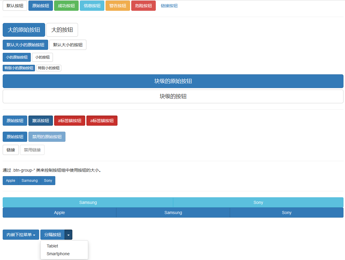
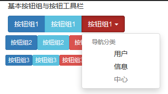
描述:BS提供了几种样式的Button可以快速进行标签样式的调整;<a>, <button>, 或 <input>元素上;
1 2 3 4 5 6 7 8 9 10 11 12 13 14 15 16 17 18 19 20 21 22 23 24 25 26 27 28 29 30 31 32 33 34 35 .btn 为按钮添加基本样式 .btn-default 默认/标准按钮 .btn-primary 原始按钮样式(未被操作) .btn-success 表示成功的动作 .btn-info 该样式可用于要弹出信息的按钮 .btn-warning 表示需要谨慎操作的按钮 .btn-danger 表示一个危险动作的按钮操作 .btn-link 让按钮看起来像个链接 (仍然保留按钮行为) .btn-lg .btn-sm .btn-xs .btn-block .active .disable .btn-group .btn-group-lg|sm|xs .btn-toolbar .btn-group-vertical .btn-group-justified .dropdown-toggle .dropdown-menu .caret data-toggle="dropdown"
嵌套: 您可以在一个按钮组内嵌套另一个按钮组,即,在一个 .btn-group 内嵌套另一个 .btn-group 。
基础示例:1 2 3 4 5 6 7 8 9 10 11 12 13 14 15 16 17 18 19 20 21 22 23 24 25 26 27 28 29 30 31 32 33 34 35 36 37 38 39 40 41 42 43 44 45 46 47 48 49 50 51 52 53 54 55 56 57 58 59 60 61 62 63 64 65 66 67 68 69 70 71 72 73 74 75 76 77 78 79 80 81 82 83 84 85 86 87 88 89 90 91 92 93 94 95 96 97 98 99 100 <div class ="container" > <button type ="button" class ="btn btn-default" > 默认按钮</button > <button type ="button" class ="btn btn-primary" > 原始按钮</button > <button type ="button" class ="btn btn-success" > 成功按钮</button > <button type ="button" class ="btn btn-info" > 信息按钮</button > <button type ="button" class ="btn btn-warning" > 警告按钮</button > <button type ="button" class ="btn btn-danger" > 危险按钮</button > <button type ="button" class ="btn btn-link" > 链接按钮</button > <hr > <p > <button type ="button" class ="btn btn-primary btn-lg" > 大的原始按钮</button > <button type ="button" class ="btn btn-default btn-lg" > 大的按钮</button > </p > <p > <button type ="button" class ="btn btn-primary" > 默认大小的原始按钮</button > <button type ="button" class ="btn btn-default" > 默认大小的按钮</button > </p > <p > <button type ="button" class ="btn btn-primary btn-sm" > 小的原始按钮</button > <button type ="button" class ="btn btn-default btn-sm" > 小的按钮</button > </p > <p > <button type ="button" class ="btn btn-primary btn-xs" > 特别小的原始按钮</button > <button type ="button" class ="btn btn-default btn-xs" > 特别小的按钮</button > </p > <p > <button type ="button" class ="btn btn-primary btn-lg btn-block" > 块级的原始按钮</button > <button type ="button" class ="btn btn-default btn-lg btn-block" > 块级的按钮</button > </p > <hr > <button type ="button" class ="btn btn-primary" > 原始按钮</button > <button type ="button" class ="btn btn-primary active" > 激活按钮</button > <a href ="#" class ="btn btn-danger active" > a标签锚按钮</a > <a href ="#" class ="btn btn-danger active" role ="button" > a标签锚按钮</a > <br > <br > <p > <button type ="button" class ="btn btn-primary" > 原始按钮</button > <button type ="button" class ="btn btn-primary" disabled ="disabled" > 禁用的原始按钮</button > </p > <p > <a href ="#" class ="btn btn-default" role ="button" > 链接</a > <a href ="#" class ="btn btn-default disabled" role ="button" > 禁用链接</a > </p > <hr > <p > 通过 .btn-group-* 类来控制按钮组中使用按钮的大小。 </p > <div class ="btn-group btn-group-sm" > <button type ="button" class ="btn btn-primary" > Apple</button > <button type ="button" class ="btn btn-primary" > Samsung</button > <button type ="button" class ="btn btn-primary" > Sony</button > </div > <hr > <div class ="btn-group btn-group-justified" > <div class ="btn-group" > <button type ="button" class ="btn btn-info" > Samsung</button > </div > <div class ="btn-group" > <button type ="button" class ="btn btn-info" > Sony</button > </div > </div > <div class ="btn-group btn-group-justified" > <a href ="#" class ="btn btn-primary" > Apple</a > <a href ="#" class ="btn btn-primary" > Samsung</a > <a href ="#" class ="btn btn-primary" > Sony</a > </div > <br > <br > <div class ="btn-group" > <button type ="button" class ="btn btn-primary dropdown-toggle" data-toggle ="dropdown" > 内嵌下拉菜单 <span class ="caret" > </span > </button > <ul class ="dropdown-menu" role ="menu" > <li > <a href ="#" class ="btn" > 成绩查询 <span class ="caret" > </span > </a > </li > <li > <a href ="#" class ="btn" > 分数查询 <span class ="caret" > </span > </a > </li > </ul > </div > <div class ="btn-group" > <button type ="button" class ="btn btn-primary" > 分隔按钮</button > <button type ="button" class ="btn btn-primary dropdown-toggle" data-toggle ="dropdown" > <span class ="caret" > </span > </button > <ul class ="dropdown-menu" role ="menu" > <li > <a href ="#" > Tablet</a > </li > <li > <a href ="#" > Smartphone</a > </li > </ul > </div > </div >
weiyigeek.top-
按钮组与按钮工具栏示例:1 2 3 4 5 6 7 8 9 10 11 12 13 14 15 16 17 18 19 20 21 22 23 24 25 26 27 28 29 30 31 32 33 34 35 36 37 <div class ="container" > <p > 基本按钮组与按钮工具栏</p > <div class ="btn-toolbar" role ="toolbar" > <div class ="btn-group" > <button type ="button" class ="btn btn-primary" > 按钮组1</button > <button type ="button" class ="btn btn-info" > 按钮组1</button > <div class ="btn-group dropdown" > <button type ="button" class ="btn btn-danger dropdown-toggle" data-toggle ="dropdown" > 按钮组1 <span class ="caret" > </span > <span class ="sr-only" > 大屏幕显示</span > </button > <ul class ="dropdown-menu" > <li class ="dropdown-header" > 导航分类</li > <li class ="text-center" > <a href ="#user" > 用户</a > </li > <li class ="text-center" > <a href ="#message" > 信息</a > </li > <li class ="disabled text-center" > <a href ="#center" > 中心</a > </li > </ul > </div > </div > <div class ="btn-group-sm" > <input type ="button" class ="btn btn-primary" value ="按钮组2" > <input type ="button" class ="btn btn-info" value ="按钮组2" > <input type ="button" class ="btn btn-danger" value ="按钮组2" > </div > <div class ="btn-group-xs" > <a href ="#user" class ="btn btn-primary" > 按钮组3</a > <a href ="#info" class ="btn btn-info" > 按钮组3</a > <a href ="#danger" class ="btn btn-danger" > 按钮组3</a > </div > </div > </div >
weiyigeek.top-
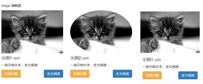
Image 图片 描述:Bootstrap 提供了三个可对图片应用简单样式的 class:1 2 3 4 5 6 7 .img-rounded .img-circle .img-thumbnail .img-responsive .caption .fakeimg
基础示例
1 2 3 4 5 6 7 8 9 10 11 12 13 14 15 16 17 18 19 20 21 22 23 24 25 26 27 28 29 30 31 32 33 34 35 36 37 38 39 40 41 42 43 44 45 46 47 <img src ="" class ="img-responsive" alt ="响应式图像" > <style > .img-responsive { display: block; #当您把元素的 display 属性设置为 block,以块级元素显示。 height: auto; #相关元素的高度取决于浏览器。 max-width: 100%; #让图像按比例缩放,不超过其父元素的尺寸。 } .fakeimg { height: 200px; background : #aaa ; } </style > <div class ="row" > <div class ="col-sm-6 col-md-3" > <div class ="img-rounded" > <img src ="https://www.runoob.com/wp-content/uploads/2014/06/kittens.jpg" alt ="图片" class ="img-responsive" > </div > <div class ="caption" > <h4 > 示例1.<small > 说明</small > </h4 > <p > 一些示例文本,全文阅读...</p > <a href ="#" class ="btn btn-warning" > 不感兴趣</a > <a href ="#" class ="btn btn-primary pull-right" > 全文阅读</a > </div > </div > <div class ="col-sm-6 col-md-3" > <img src ="https://www.runoob.com/wp-content/uploads/2014/06/kittens.jpg" alt ="图片圆角" class ="img-circle img-responsive" > <div class ="caption" > <h4 > 示例2.<small > 说明</small > </h4 > <p > 一些示例文本,全文阅读...</p > <a href ="#" class ="btn btn-warning" > 不感兴趣</a > <a href ="#" class ="btn btn-primary pull-right" > 全文阅读</a > </div > </div > <div class ="col-sm-6 col-md-3" > <div class ="thumbnail" > <img src ="https://www.runoob.com/wp-content/uploads/2014/06/kittens.jpg" alt ="图片缩略图" class ="img-responsive" > <div class ="caption" > <h4 > 示例1.<small > 说明</small > </h4 > <p > 一些示例文本,全文阅读...</p > <a href ="#" class ="btn btn-warning" > 不感兴趣</a > <a href ="#" class ="btn btn-primary pull-right" > 全文阅读</a > </div > </div > </div > </div >
weiyigeek.top-
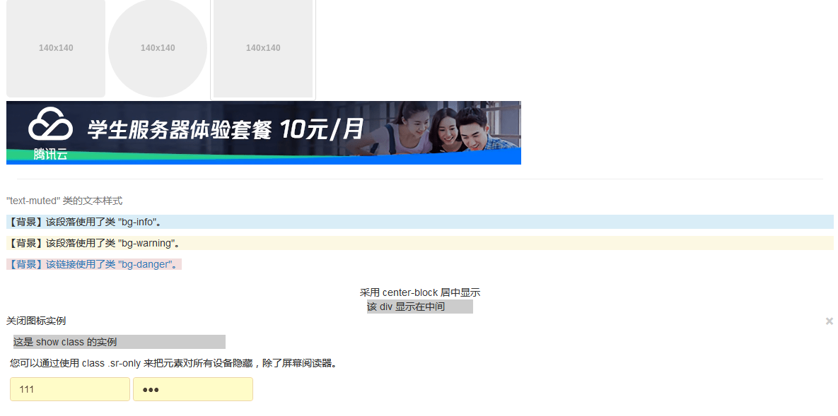
BS 辅助类 1 2 3 4 5 6 7 8 9 10 11 12 13 14 15 16 17 18 19 20 21 22 23 24 25 26 27 28 29 30 .text-muted .text-primary .text-success .text-info .text-warning .text-danger .text-hide .bg -primary 表格单元格使用了 "bg-primary" 类 .bg -success 表格单元格使用了 "bg-success" 类 .bg -info 表格单元格使用了 "bg-info" 类 .bg -warning 表格单元格使用了 "bg-warning" 类 .bg -danger 表格单元格使用了 "bg-danger" 类 .pull-left .pull-right .center-block .clearfix .show .hidden .sr-only .sr-only-focusable .close .caret
基础示例:1 2 3 4 5 6 7 8 9 10 11 12 13 14 15 16 17 18 19 20 21 22 23 24 25 26 27 28 29 30 31 32 33 34 35 36 37 38 39 40 41 42 43 44 45 46 <div class ="container" > <div class ="row" > <img src ="https://www.runoob.com/wp-content/uploads/2014/06/download.png" class ="img-rounded" > <img src ="https://www.runoob.com/wp-content/uploads/2014/06/download.png" class ="img-circle" > <img src ="https://www.runoob.com/wp-content/uploads/2014/06/download.png" class ="img-thumbnail" > <img src ="https://tpc.googlesyndication.com/daca_images/simgad/13063754865781208952" alt ="图片响应式" class ="img-responsive" > </div > <hr > <div class ="row" > <p class ="text-muted" > "text-muted" 类的文本样式</p > <p class ="bg-info" > 【背景】该段落使用了类 "bg-info"。</p > <p class ="bg-warning" > 【背景】该段落使用了类 "bg-warning"。</p > <a class ="bg-danger" href ="/index.php" > 【背景】该链接使用了类 "bg-danger"。</a > </div > <br > <div class ="center-block" style ="width:170px;" > 采用 center-block 居中显示</div > <div class ="center-block" style ="width:150px;background-color:#ccc;" > 该 div 显示在中间</div > <div class ="row" > <p > 关闭图标实例 <button type ="button" class ="close" aria-hidden ="true" > ×</button > </p > <div class ="show" style ="margin-left:10px;width:300px;background-color:#ccc;" > 这是 show class 的实例 </div > <div class ="hidden" style ="width:200px;background-color:#888;" > 这是 hide class 的实例 </div > </div > <div class ="row" style ="padding: 10px 100px 19px 5px;" > <p > 您可以通过使用 class .sr-only 来把元素对所有设备隐藏,除了屏幕阅读器。</p > <form class ="form-inline" role ="form" > <div class ="form-group" > <label class ="sr-only" for ="email" > Email 地址</label > <input type ="email" class ="form-control" placeholder ="Enter email" > </div > <div class ="form-group" > <label class ="sr-only" for ="pass" > 密码</label > <input type ="password" class ="form-control" placeholder ="Password" > </div > </form > </div > </div >
weiyigeek.top-
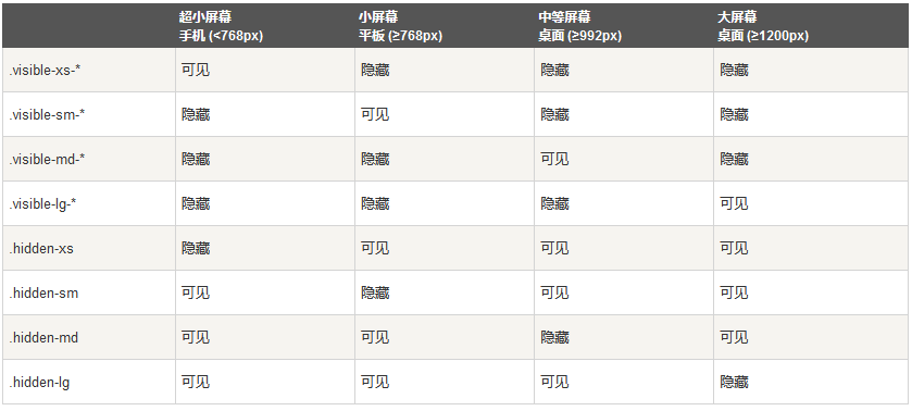
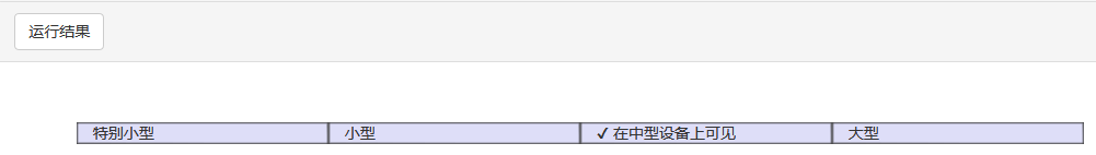
响应式实用工具 描述:可以通过媒体查询结合大型、小型和中型设备,实现内容对设备的显示和隐藏。
weiyigeek.top-
从 v3.2.0 版本起,形如 .visible-- 的类针对每种屏幕大小都有了三种变体,每个针对 CSS 中不同的 display 属性,以超小屏幕(xs)为例,可用的 .visible-*-* 类是:.visible-xs-block、.visible-xs-inline 和 .visible-xs-inline-block。列表如下:-block|display: block; -inline|display: inline;
打印类:下表列出了打印类。使用这些切换打印内容。1 2 3 4 5 6 7 8 9 10 11 12 13 14 15 16 17 visible-on visible-xs visible-sm visible-md visible-lg .visible-print-block .visible-print-inline .visible-print-inline-block .hidden-print
基础示例:1 2 3 4 5 6 7 8 9 10 11 12 13 14 15 16 17 18 19 20 21 22 23 24 25 26 <div class ="container" style ="padding: 40px;" > <div class ="row visible-on" > <div class ="col-xs-6 col-sm-3" style ="background-color: #dedef8; box-shadow: inset 1px -1px 1px #444, inset -1px 1px 1px #444;" > <span class ="hidden-xs" > 特别小型</span > <span class ="visible-xs" > ✔ 在特别小型设备上可见</span > </div > <div class ="col-xs-6 col-sm-3" style ="background-color: #dedef8; box-shadow: inset 1px -1px 1px #444, inset -1px 1px 1px #444;" > <span class ="hidden-sm" > 小型</span > <span class ="visible-sm" > ✔ 在小型设备上可见</span > </div > <div class ="clearfix visible-xs" > </div > <div class ="col-xs-6 col-sm-3" style ="background-color: #dedef8; box-shadow: inset 1px -1px 1px #444, inset -1px 1px 1px #444;" > <span class ="hidden-md" > 中型</span > <span class ="visible-md" > ✔ 在中型设备上可见</span > </div > <div class ="col-xs-6 col-sm-3" style ="background-color: #dedef8; box-shadow: inset 1px -1px 1px #444, inset -1px 1px 1px #444;" > <span class ="hidden-lg" > 大型</span > <span class ="visible-lg" > ✔ 在大型设备上可见</span > </div > </div > </div >
weiyigeek.top-